In today’s fast-paced digital world, having a website that adapts to every device is no longer a luxury—it’s a necessity. With over 50% of global web traffic coming from mobile devices, responsive design is key to ensuring your Connecticut business remains competitive. If you’ve ever struggled to navigate a website on your smartphone or tablet, you understand why responsive design is essential. This article will explain why responsive design is crucial for your business’s success and how it can help you capture more customers, improve user experience, and enhance your online visibility.
What Is Responsive Design and Why Does It Matter for Connecticut Businesses?
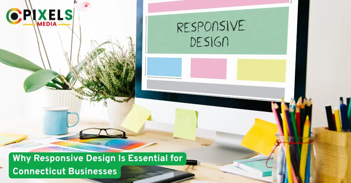
Responsive design refers to the practice of designing and developing a website to provide an optimal viewing experience across a wide range of devices, from desktop computers to mobile phones. The goal is to create a seamless experience that automatically adjusts the layout, content, and images based on the screen size.
For Connecticut businesses, a responsive website is crucial for meeting the growing demand for mobile-first browsing. In fact, research by Statista reveals that mobile internet usage is expected to account for nearly 73% of total web traffic in 2025. With so many potential customers browsing from their smartphones, ensuring your website is mobile-friendly is no longer optional—it’s essential for staying relevant in the competitive Connecticut market.
The Key Benefits of Responsive Design for Connecticut Businesses
1. Enhanced User Experience (UX)
A responsive website adapts to the device’s screen size, providing a consistent experience across smartphones, tablets, and desktops. By eliminating the need for zooming, scrolling, or horizontal scrolling, responsive design creates a smoother, more enjoyable browsing experience. This leads to higher user satisfaction and encourages visitors to stay longer on your site, increasing the chances of conversions.
- Faster loading times: A responsive site usually loads faster, especially on mobile devices, reducing bounce rates and improving user engagement.
- Improved accessibility: Users with different needs or impairments can easily access content, helping your business meet accessibility standards and broadening your audience reach.
2. Improved SEO and Search Rankings
Google prioritizes mobile-friendly websites in its search rankings, meaning that responsive design directly impacts your search engine optimization (SEO) efforts. In fact, Google’s mobile-first indexing means that the mobile version of your website is now considered the primary version.
By having a responsive design, Connecticut businesses can improve their SEO rankings and increase organic traffic. Responsive websites are easier for Google to crawl and index, and since there is only one version of the website (compared to separate mobile and desktop versions), it consolidates your efforts and avoids the risk of duplicate content.
3. Increased Conversion Rates
When your website is responsive, it creates a smooth and consistent experience for users regardless of the device they’re using. This can have a direct impact on your conversion rates. Visitors are more likely to complete desired actions—such as making a purchase, signing up for a newsletter, or filling out a contact form—when they don’t have to deal with issues like slow loading or poorly formatted content.
Responsive design also helps with local SEO, which is vital for Connecticut businesses. By improving your site’s performance and appearance on mobile devices, you can better target customers who are searching for products or services in your local area.
4. Cost and Time Efficiency
Building and maintaining separate websites for mobile and desktop platforms can be time-consuming and expensive. With a responsive design, you only need to manage one website, which saves both time and resources. Furthermore, you’ll only need to update and optimize one site, making it easier to keep your content fresh and relevant across all platforms.
Why Choose CoPixels Media for Your Responsive Web Design Needs?
At CoPixels Media, we specialize in designing and developing responsive websites that meet the unique needs of Connecticut businesses. Our team understands the importance of a mobile-first approach, and we prioritize delivering websites that provide seamless user experiences across all devices. By incorporating the latest trends in web design and utilizing the best SEO practices, we ensure that your site not only looks great but also performs exceptionally well.
We take the time to understand your business goals and create a responsive design that enhances your brand’s presence while driving traffic and conversions. Whether you’re looking to redesign your existing site or create a new one from scratch, CoPixels Media is here to help you stay ahead of the competition.
Frequently Asked Questions (FAQs)
What is responsive design?
Responsive design ensures your website adjusts to different screen sizes and devices, providing a consistent user experience across all platforms.
How does responsive design impact my SEO?
Google prioritizes mobile-friendly websites in search results, so responsive design can improve your SEO and help you rank higher.
Why should I care about mobile-first design?
With over half of internet traffic coming from mobile devices, having a mobile-first website ensures you meet the needs of the majority of online users.
Is responsive design expensive to implement?
While it may require an investment up front, responsive design can save you money in the long term by eliminating the need for multiple versions of your website.
Will responsive design affect my website’s performance?
No, responsive design is optimized for faster loading times on mobile devices, improving your site’s performance and reducing bounce rates.
Does responsive design improve user engagement?
Yes, by providing a smooth and consistent experience across devices, responsive design encourages visitors to stay longer and engage more with your content.
Can responsive design help me reach more customers locally?
Yes, it improves your site’s local SEO performance, helping your business rank better in local searches and attract more customers in Connecticut.
Stay Ahead with a Responsive Website
In today’s digital world, why responsive design is essential for Connecticut businesses cannot be overstated. A responsive website not only provides a better user experience but also boosts your SEO rankings, increases conversions, and saves time and money in the long run. By investing in responsive design, you’re ensuring that your website is future-proof and accessible to all users, regardless of their device.
Ready to Optimize Your Website for All Devices?
Get in touch with CoPixels Media today to ensure your website is fully responsive and optimized for mobile and desktop users. Let us help you create a seamless user experience that drives results and keeps your Connecticut business ahead of the competition.


No comment